Black and White Photography
by
Paul Roark
Welcome to My Home Page
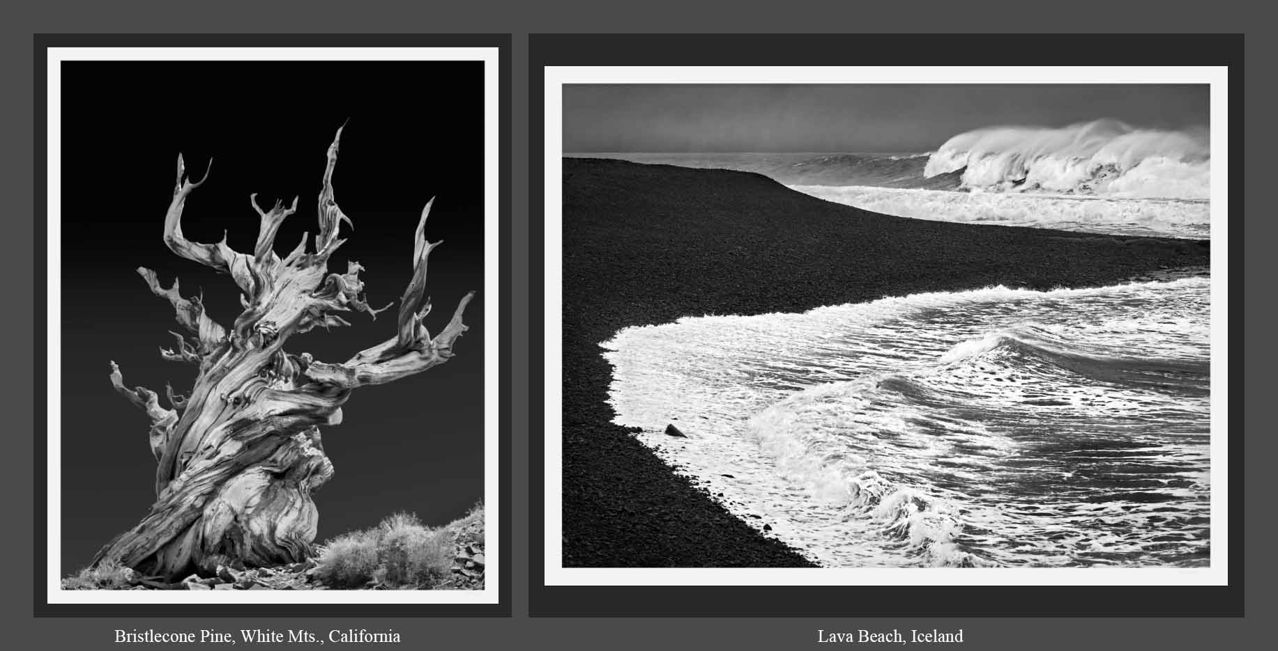
My current Gallery Los Olivos set of prints is shown above.
The image on the left is a Bristlecone Pine in the White Mts. in California. These trees are the oldest living things. They can live 4000 years, and then stay up after they die another 4000 years. The image on the right is Lava Beach, in Iceland.
Photos & Prints by Area
Seine & Rhone Cruise, France - 2024
Rhine Cruise, Paris & Amsterdam - 2023
Western Canada, 2022
Haskell's Beach, Goleta, CA
GT Workshop at White Mountain
Golden Trout Workshops
Iceland, Oct. 2017
Kansas City, MO -- 2018
Los Angeles -- Walt Disney Concert Hall & Other Favorite Places
Glacier National Park and Swan Valley, Montana
Kauai -- *Color* (mostly) Sunsets and landscapes
Washington, D.C.
Portland, October 2014
Italy, May 2014
Chicago, May 2013
Ansel Adams Wilderness
Yosemite National Park
Santa Ynez Valley Skies and California Central Coast
Paris & Boston, September 2011
Olympic Peninsula
Impressions of NYC
is a small collection of some shots I took as a tourist in New York City
in July 2010.
Mammoth Lakes and Owens Valley
Old Favorites
Hubble-Monocerotis-Dunes print.
As one who has long been fascinated with
exploring our universe through optics, it was an honor to meet the founder
of the optical company that built the Hubble space telescope; by chance he was a friend of the family.
Follow the link to the left for more information.
Index of Other Photos
For the
Index and Thumbnails
of the other, older photos in my internet gallery
click here.
Gallery Los Olivos
I have a permanent display at Gallery Los Olivos, in Los Olivos, California.
You can call Gallery Los Olivos at (805) 688-7517 and have the gallery sitter
notify me if you have any questions about my work. Please feel free to
stop by the Gallery any time. We are usually open 10 am - 5 pm, 7 days a week.
For information on Gallery Los Olivos,
click here.
Black & White ("B&W") Print and Technical Information
For technical information on inkjet printing and photo-related subjects, please go to
www.PaulRoark.com/BW-Info/.
Over the years, I have worked in several somewhat distinct media,
including, traditional darkroom and silver printing,
various internegative processes, and, in recent years, a variety
of inkjet media. With the advent of modern inkjet printers and
inks, it became clear that the silver print had become an "alternative"
medium. The wet process has simply been eclipsed by the best modern
digital approaches. One of my efforts has been to push the envelope in
B&W inkjet printing, which has taken a back seat to color by the
major printer companies.
As a former darkroom worker who often mixed his own developers from
the raw components (for example, POTA for Tech Pan film),
the B&W inkset development work I did came rather naturally.
(A brother who was a PhD chemist in the carbon field didn't hurt.)
At
www.PaulRoark.com/BW-Info/
I cover or link to numerous current as well as older inksets and workflows that I have used in the past.
For a number of years MIS Associates (inksupply.com) sold the older inksets that I
developed. When their founder sold the company, it lost interest in B&W inks. I have continued
to source the inputs for the former MIS inks through
STS Inks
in Florida. And, while I have worked with a number of different papers, these days almost all
of my work uses Red River's
UltraPro satin paper. All of my B&W ink work
and mixes are done on an open-source, royalty-free basis. I just make and
continue to make what I want and have published my formulas and profiles.
Of particular interest to
B&W printers who want the best for the least, the generic dilution base formulas for diluting
matte black pigment inks is also linked to this page. These allow creative printers to make
their own unique and very cost effective inksets, but for matte papers only.
My primary wide format printer (an Epson 9800) is loaded with a variant of what I call my
"Glossy Carbon Variable Tone" inkset. This puts 100% carbon pigments,
which are by far the most lightfast, in all but
one of the ink positions. In one ink position I have a specially formulated "toner" that is
light blue. This gives a print tone range from warm (natural carbon) to neutral, while
at the same time keeping the job of making profiles rather simple.
The basic principle for making the most archival B&W prints is simply to keep the carbon content as high as
possible for the tone you want, and use the best color (toner) pigments available. This maximizes
longevity and virtually emiminates artifacts such as metamerism.
I generally print on Red River UltraPro Satin paper and coat the prints with Premier Art's Print Shield.
I mount the prints on acid free foam core or, for very large prints, have a service bureau
mount them on a substrate that is appropriate for the size of the print. I currently (2025) use a pressure
sensitive adhesive and 25" wide pressure roller to get the best, bubble-free and acid-free
display mounts for my 22 by 28 inch prints for wall display.
Image Capture -- Cameras & Lenses
Optimizing the image capture phase of my medium has also been a challenge I have enjoyed.
Over the years I have used B&W film sizes from 4x5 to 35mm. In the film era, I thought medium format was the best compromise. My Rollei SL66 still sits proudly in a display case in my home.
Digital technology, of course, knocked out film.
Until 2024, I used mostly Lieca M optics on a modified Sony. A 25 mp sensor is enough for the 22 x 28 - 36" wall display prints I generally make, and also enough for the large (about 5 feet wide), multi-frame, stitched panoramas I favor. With inkjet technology, such prints are very viable and not that expensive to make. Mounting the large ones is something I have a photo service bureau do.
With the advent of Topaz's AI Gigapixel, a good "35mm" size sensor with an excellent lens can produce what would be large format (4x5") film quality in the film days. That said,the smaller aps-c frame, which I tried for a year, still appears to be more limited that I would prefer. As such, I have moved back to the 35mm size digital sensor size. (Currently
the Sony RX1r.) This, with the help of AI Gigapixel software, gives me the quality I need for wall size prints and panoramas that are totally sharp at all viewing distances.
The bottom line is that a very good (aprox.) 1 lb. camera on the belt can now do gallery-quality, large wall display prints. (And my 25 lb. Rollei SL66 outfit will stay in the display case. Progress!)
Purchasing Prints
If you are interested in prints of any images on the web site,
please
contact me.
In general, B&W prints are available in all sizes up to
44" by whatever (5 feet or more). All are printed with a dedicated B&W, carbon pigment inkset of my own design.
(I do not sell color prints.)
Note on Limited Editions:
In general, all prints are sold on an open edition basis.
I have found, as a practical matter, that my sales volume is low enough that limits are irrelevant.
I have also found that buyers are interested in the images and do not care about
the technology or "limited edition" status (which is often misleading nonesense).
All of my prints are made individually, as needed.
Arches prints - "Carbon on Cotton":
I consider my most archival print technology to be 100%
carbon pigments on Arches Hot Press (uncoated) watercolor paper. While I like the nature of
this medium, I've found the market is simply interested in the image, which I totally understand. All of my prints use
predominantly carbon pigments that will outlive all of us.
Articles about and Exhibits of My Photography
The December 2013 "Shutterbug" magazine, in the Digital Help column regarding inks suggested,
"visiting a black-and-white expert's website, www.PaulRoark.com."
In June 2018 I was featured on the Red River webpage/blog. The article can be see
here. (But note that the actual prints are not as dark as they appear on the Red River website.)
From mid-Februry to mid-April 2019 a broad cross-section of my work was featured at the Elverhoj Museum in
Solvang, California. Click
here for a copy of the postcard relating to the exhibit. For a copy of the review of the Elverhoj show by the SB Newspress,
click here.
And there is always an exhibit of my work at Gallery Los Olivos (see above).
Elverhoj Museum Photo Restoration Project
As part of Solvang California's centennial celebration, the Elverhoj Museum in Solvang
displayed numerous historic images that have been contributed by local
residents, and digitally restored and printed by me. While the gallery show at the Elverhoj
is no longer up, some of the images remain in the permanent displays at the Elverhoj Museum.
Additionally, Montecito Bank and Trust at Alamo Pintado and Highway 246 has a good display of
some of my favorites. These are 100% carbon prints.
For information about the Elverhoj museum and for a book of the old photos,
click here.
For a PDF that briefly explains some of the procedures I used to
restore the old photos,
click here.
Contact
If you have any comments or questions, or are interested in
copies of any of my images, please do not hesitate to
contact me at Roark.Paul@gmail.com.
Thank you for visiting my humble website.
Paul Roark
Solvang, CA, USA
www.PaulRoark.com
All Photographs -- Copyright 1980-2025 Paul Roark -- All Rights Reserved